


Do you want to have transparent and clear access to your company data - whether in your office or on the road? Then Microsoft Power BI is the right entry point for your Business Intelligence from the Microsoft Cloud. In the updates of Microsoft's Business Intelligence solution in recent months, new features and previews have been made available. We would like to present a few selected ones to you here.
Power BI App for Microsoft Teams
Since more and more companies are using Microsoft Teams as a central collaboration tool, Microsoft has now also enabled the integration of Power BI in Teams. This ensures even more efficient collaboration directly within Teams:

To learn how to add the Power BI app to Teams, see the related documentation from Microsoft here.
DirectQuery for Power BI datasets and Azure Analysis Services.
This new feature (available as a preview) gives users more flexibility and control over table selection. Previously, when a DirectQuery connection was made to a dataset or Azure Analysis Services model, the model always contained all tables. Now, unnecessary tables can be removed from the model using the field list. This keeps the model clear, even if the dataset to which the connection is made contains multiple tables. In addition, when establishing a connection with a dataset, it is now possible to specify exactly which tables are to be loaded at all. This means that all data no longer has to be loaded if only a certain subset of tables is searched for.

SWITCH performance optimisation
The performance of the SWITCH function in DAX has been optimised. The improved performance is particularly evident when the SWITCH function processes a large number of values or when the value expressions contain key figure references.
Azure Maps Power BI visual
Azure Maps' Power BI visual provides a variety of data visualisations for spatial data on a map. It is estimated that over 80% of business data has a location context. The Azure Maps Power BI visual can be used to gain insights into how this location context relates to and influences business data.

The following requirements must be met to use the Azure Maps Power BI visual:
The Azure Maps Power BI visual must be enabled in Power BI Desktop - to do this, select File > Options and Settings > Options > Preview Features, then select the Azure Maps Visual checkbox. If the Azure Maps Visual is not available after enabling this setting, a client administrator switch may need to be enabled in the Administrator Portal. The record must contain fields with latitude and longitude information.
Once the Azure Maps Power BI visual is enabled, the Azure Maps icon can be selected in the Visualisations area.

Heat map layer - Azure Maps Visual
The October update introduced a heat map layer in Azure Maps Visual as a preview. The heat map displays colour patterns on the map to show the density of data points, uses a range of colours and shows the 'hotspots' of data on a map. This allows data sets with a large number of points to be visualised. This is useful, for example, to show a comparison of customer satisfaction rates or shop performance between regions or countries, or to measure the frequency with which customers visit shopping centres in different locations.

The heatmap visualisations can be extensively customised and individualised. Azure Maps can be enabled via the following path: File > Options and Preferences > Options > Preview Features, then toggle the Azure Maps Visual to On.
New format area in Power BI Desktop
Since the November update, it has been possible to activate the preview for the new format area (format window). Here, special attention was paid to increasing the user-friendliness even more.
For example, the format tab icon has been updated and a descriptive subtitle has been added to simplify the search for the format pane. To make it easier to find the format page settings, Microsoft has added a new format page icon that is visible when no visuals are selected and the canvas is ready for formatting.

Many other improvements to the format area can be found in the relevant documentation from Microsoft.
Pie and doughnut chart rotation
Currently, pie and ring chart slices are drawn clockwise, starting at the 12 o'clock position. This causes the final slices to be drawn near the first large value and approach it clockwise from the opposite side. These final slices are often smaller values and thus smaller slices.

While this creates an intuitive pie chart, it leaves less space for data labels describing the smaller segments because the text is horizontal but the segments are vertical. A new rotation option has now been introduced in the formatting area to control where the circle is started to be drawn. The function can be found in the shape card in the old formatting pane as "start angle" and in a separate rotation card in the new formatting pane.

Sparklines
For December, the Sparklines function has been made available as a preview. Sparklines are small charts that are displayed in cells of a table or matrix. This makes it easier to quickly compare a large number of trends. Sparklines can be used to show trends in a range of values, such as seasonal increases or decreases, business cycles, or to highlight maximum and minimum values.

Sparklines can be added to both a table and a matrix visualisation. The item is created in the context menu when the preview is activated.

A dialogue box can then be used to configure the details of the sparkline. The numeric field started with is pre-filled for the y-axis, but if needed both the field and the summary type can be changed.

As soon as Create is clicked, the sparkline is automatically added as a new column to the table or matrix. The properties of the sparkline can be adjusted at any time using the Edit Sparkline option in the context menu of the value. In the formatting area, the Sparklines tab can be used to customise the line and marker formatting of the sparkline - for example, change the line colour and width, add markers for different value types (highest, first, last, etc.) and set the marker size, colour and shape. The chart type can also be changed from a line chart to a column chart.

Power BI supports up to five sparklines per visual and displays up to 52 points per sparkline. For performance reasons, the maximum number of columns in a matrix is limited to 20 even with Sparklines turned on. Note that Sparklines is supported on Azure AS, but not in current local SSAS.
Visualise data quickly from Power Apps and Dynamics 365 apps
Recently, Microsoft announced a new way to visualise model-driven Power Apps and Dynamics 365 data stored in Dataverse. With a single click, Power BI now automatically generates a series of visuals that can be used to explore data to gain insights directly. The integration allows the full power of the Power Platform to be utilised.

A preview of this feature is available in Power Apps. For the option to be displayed, an administrator must enable it via the Power Apps Maker portal.
Page and Bookmark Navigators
These new navigators should save creators hours of effort in creating and managing their page or bookmark navigations. With the two newly integrated navigators, users can create page and bookmark navigations with just a few clicks.

This new function can be found in Power BI Desktop on the Insert > Buttons > Navigator tab:

Page navigator
If the Page Navigator option is selected, a page navigator is automatically created:

The page navigator is automatically synchronised with the report pages. This means:
If you want to make further adjustments to which pages should be shown or hidden in the page navigator, you can go to the Format Navigator > Pages tab:

Bookmark Navigator
Before creating the Bookmark Navigator, you must ensure that you have already created bookmarks. In addition, you should create separate bookmark groups if you want to create different bookmark navigators within the same report.

After you have created your bookmarks and selected the Bookmark Navigator option, a bookmark navigator is automatically created for you:

The bookmark navigator is automatically synchronised with your report bookmarks, which means:
If you want to make further adjustments to which bookmarks should be shown or hidden in the bookmark navigator, you can go to the Format Navigator > Bookmarks tab:

By default, all bookmarks are displayed in the bookmark navigator. However, you can create and select a specific bookmark group to display only the bookmarks within that group.

You also have the Allow deselection option, which means that users can disable the selected button in the bookmark navigator. This option is great for creating a toggleable experience or allowing a default state that is not selected. To set up one of these types of experiences, you must first set the bookmark for the desired unselected state. Here is an example of a non-selected state:

Once you have bookmarked the unselected status, you must enable Allow Deselection and select the bookmark you want to start when you deselect it:

If the bookmark you are using for deselection is already in the Bookmark Navigator, you can hide the deselection bookmark in the Navigator if you do not want to display it.
Formatting options
Just like our other buttons, there are a lot of formatting options for the navigators, including:
The navigators also contain two additional formatting options:
Grid layout
The Grid layout tab contains options to change the orientation of the navigator:
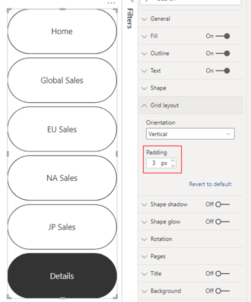
It also includes the option to change the spacing between buttons in the Navigator.
Selected status
Navigators have the option to customise the selected status of the button. You can use this option to make the selected status of the button different from the default status. In this example, we have customised both the fill and text formatting for the Selected status:

Sort legend
You can now customise the sort direction for items in your legends! To control this, go to the context menu of the visual header and select the field and sort direction in the sort legend flyout. This will also help to rearrange some of the data in visual elements such as stacked column charts and which lines or areas are rendered on top of others in other Cartesian charts. Note that currently you can only sort by the field in your legend box using this feature.

Bold/italic/underline for text formatting.
With this release, wherever you see text formatting options such as font family, font size and colour, you will find new options that allow you to bold, italicise and underline that text. In the old formatting area, this option consists of three toggle switches:

In the new formatting area, they are displayed as a familiar set of symbols in one line:

Superscript/subscript and bulleted lists for text boxes.
The text box has now been updated with three new formatting options: superscript, subscript and bulleted lists. You can access these from the floating formatting area. These allow you much more flexibility in the content you include in your text boxes!

Scorecard visual (Power BI Premium)
Deep integration of goals and scorecards into reporting solutions is a great way to drive alignment and progress across a team. To help you do this in your organisation, we are adding the new scorecard visual that can be added to Power BI reports. When included in a report, these visuals allow users to view the entire scorecard and even make updates to their goals.
")
Hybrid Tables (Power BI Premium)
We are pleased to announce support for Hybrid Tables in Power BI Premium, which in turn allows us to announce an equally exciting and groundbreaking enhancement to incremental updating - incremental updating augmented with real-time data! Now you can have lightning-fast performance in import mode and reflect the latest data changes in the data warehouse in user reports without having to perform a dataset update. For technical details on incremental refresh, see the article Incremental Refresh for Datasets in Power BI.
As the following diagram shows, a hybrid table can help strike the right balance between query performance and data timeliness.

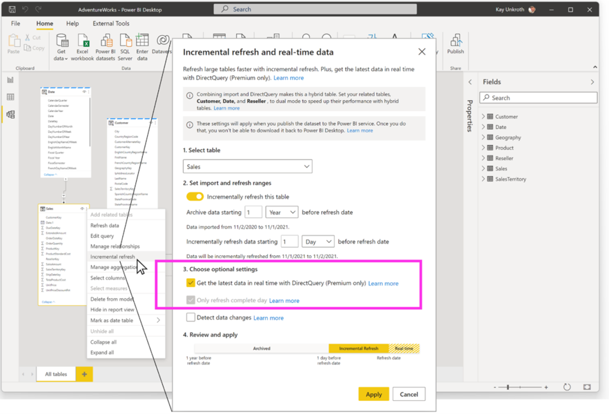
The following screenshot shows how to configure a real-time incremental refresh policy in Power BI Desktop. After the dataset is published to a Premium Per User (PPU) or Premium Capacity workspace, Power BI automatically applies the refresh policy and partitions the table as a hybrid table during data refresh.
Would you like to learn more about Power BI or do you have any questions? Our experts will be happy to help you.
TSO-DATA
Jan Grundmann
bi[at]tso[dot]de
+49(541) 1395-747